Excerpt from assignment brief:
"In this project we will redesign the interactions users have with desktop email clients - your outlooks, apple mails, and windows mails. Things we all use daily and expect to work seamlessly, but that have the power to disappoint and make a mountain out of a mole. We will focus our attention on the ability or micro-interactions to make those digital chores easier, simpler, more enjoyable - and less noticeable."
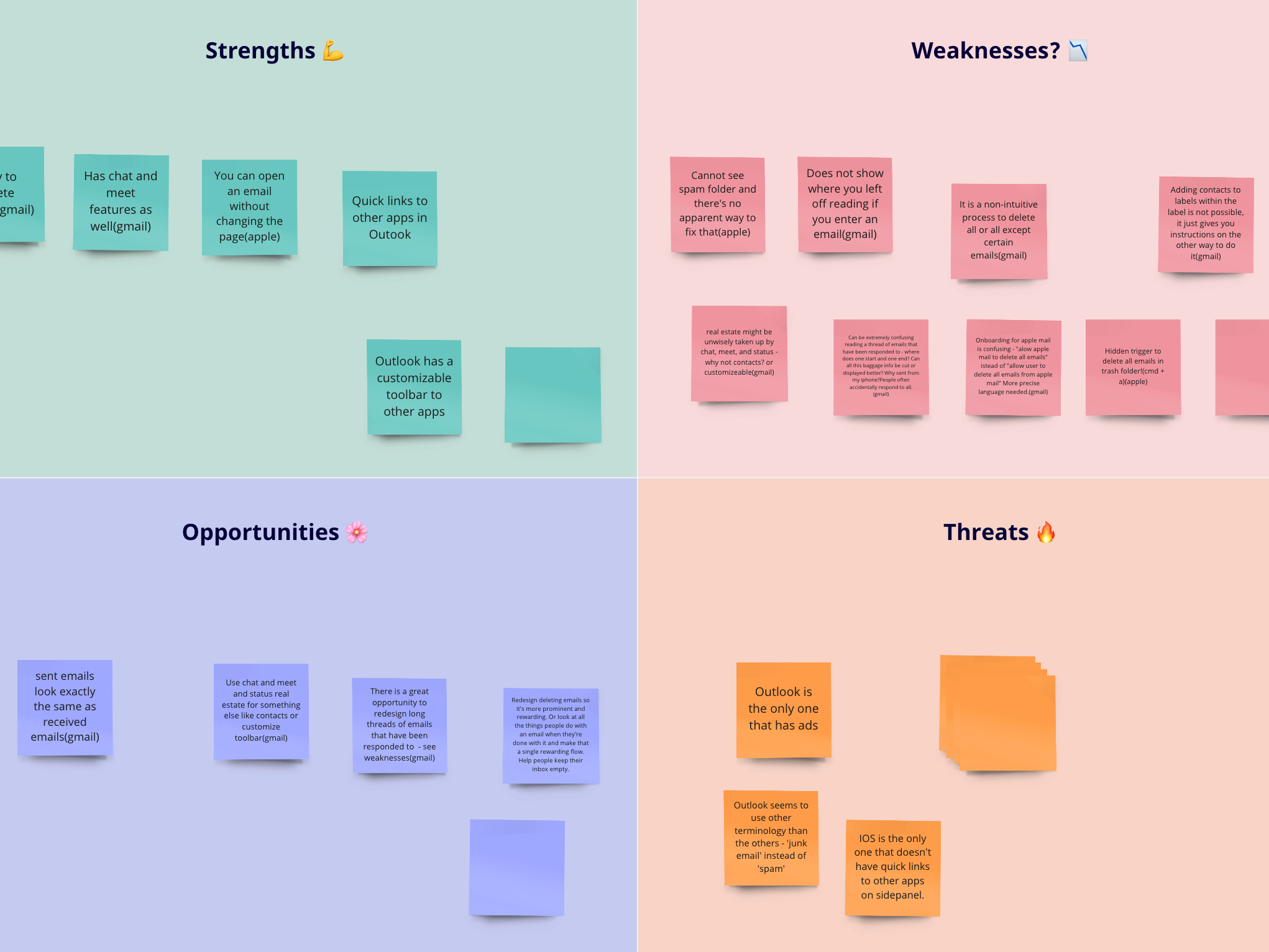
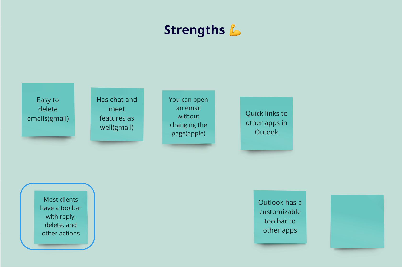
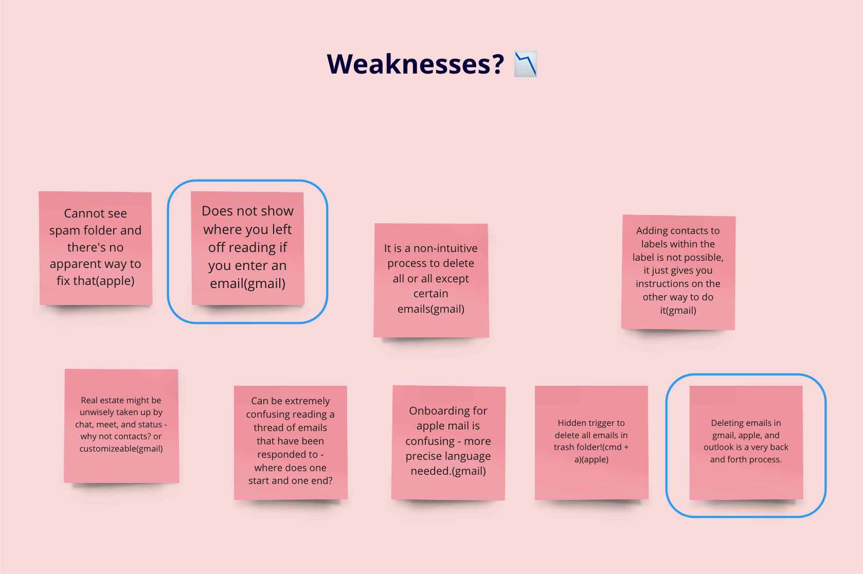
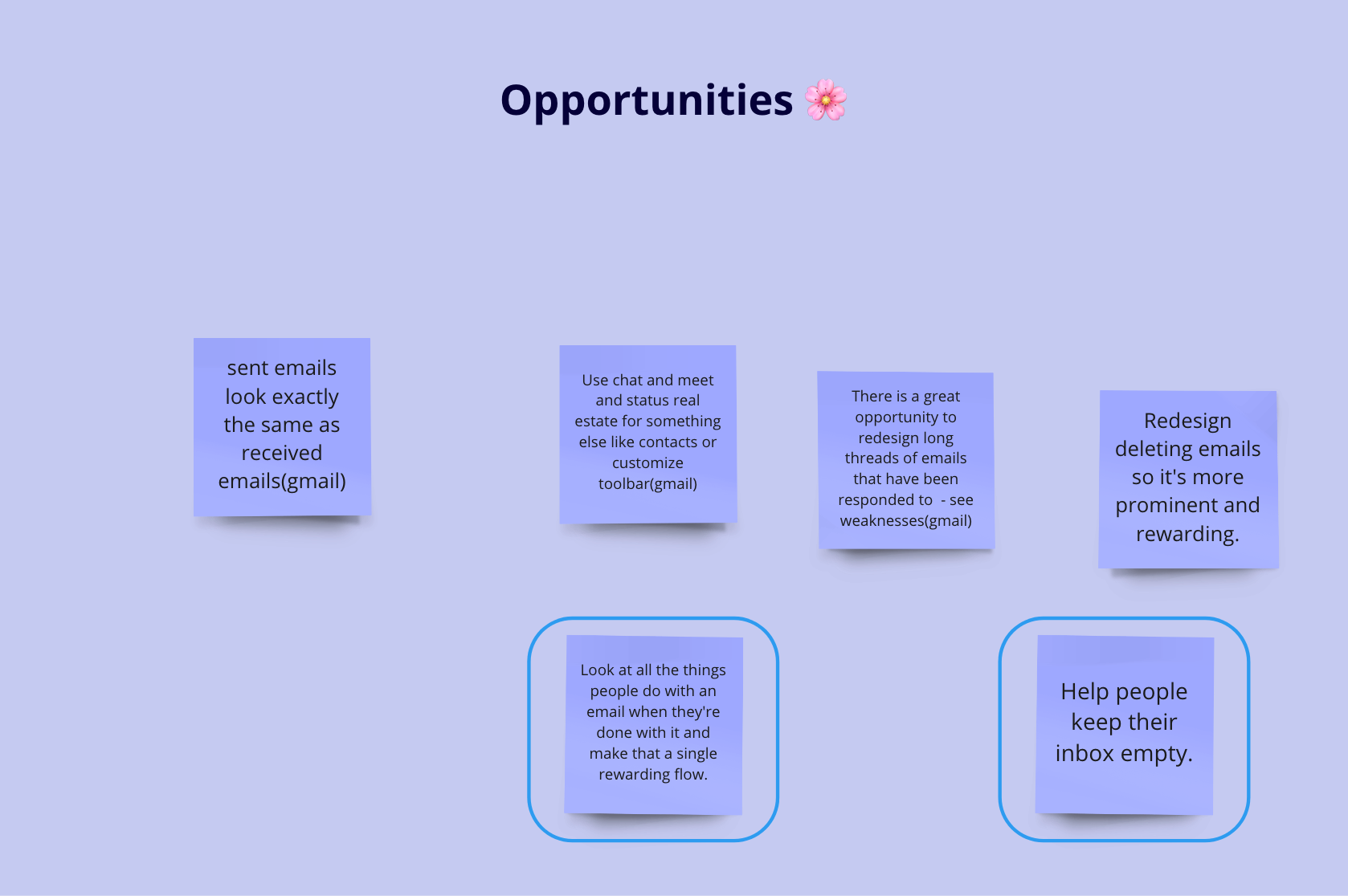
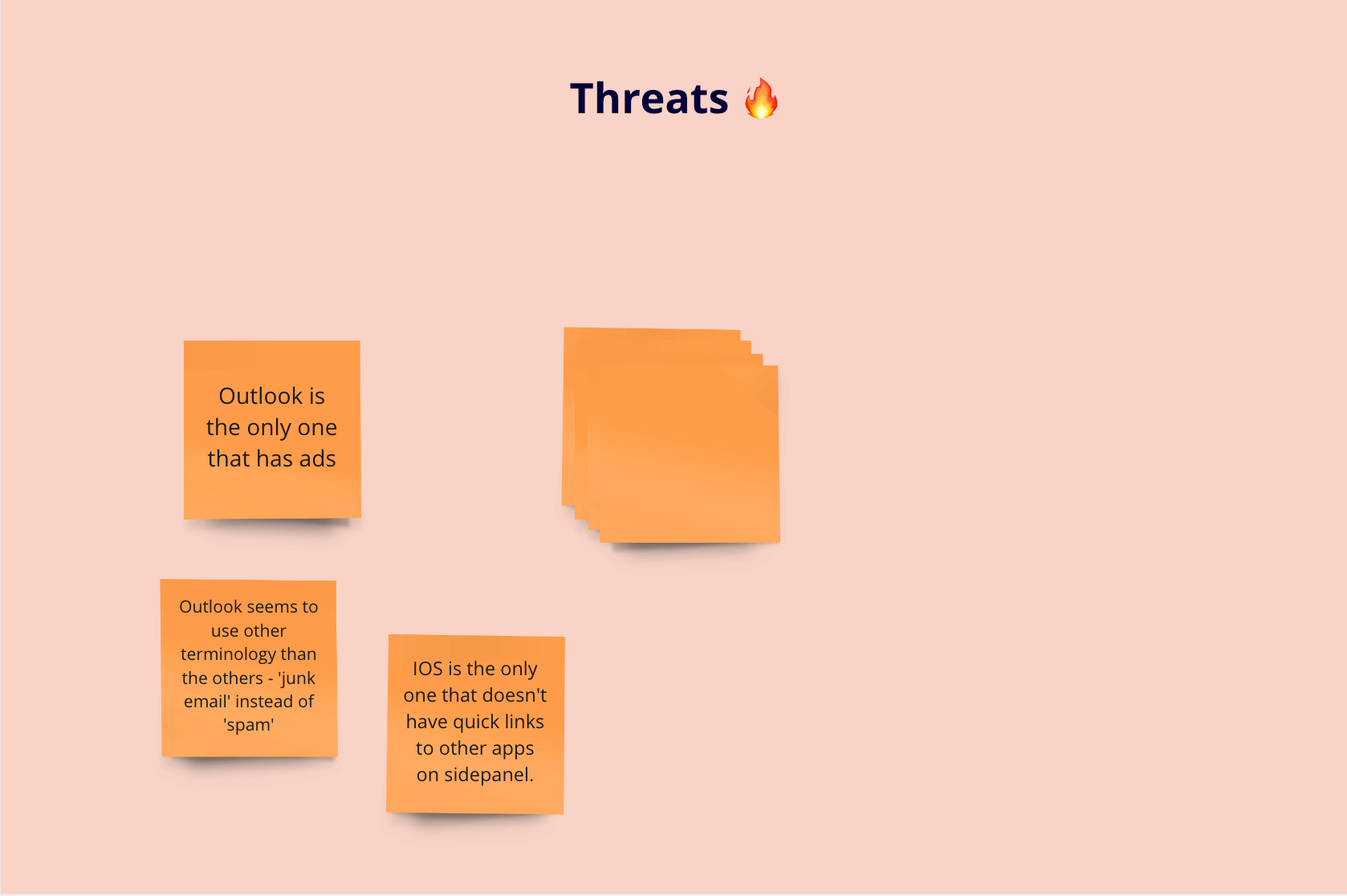
SWOT Analysis
Design Direction
How might I make the process of decluttering one's inbox more streamlined, easy, and delightful?
Precedent Exploration
The next step was to look at existing UI's that tackle the same issue as me. I was evaluating them for examples to follow and non-examples to avoid.

Turbotax has a static progress indicator. Perhaps I can use a progress bar to indicate progress in addressing unread emails.

Outlook's toolbar for handling an email includes moving to a folder, deleting, flagging, and replying.

Gmail has useful left and right arrows for moving to consecutive and previous emails.
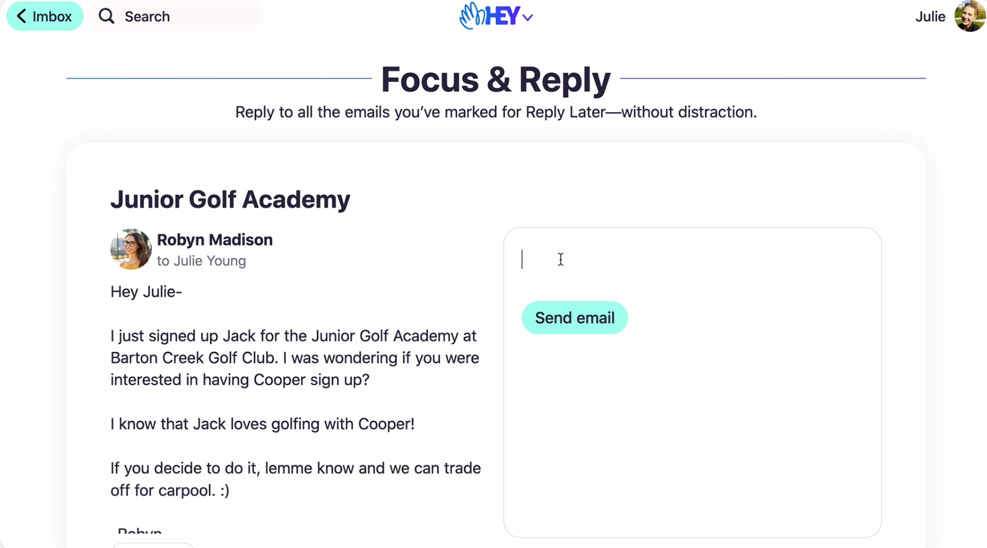
Hey has a 'Focus and Reply' mode that allows users to reply to selected emails in a scroll.
Proposal and Concept
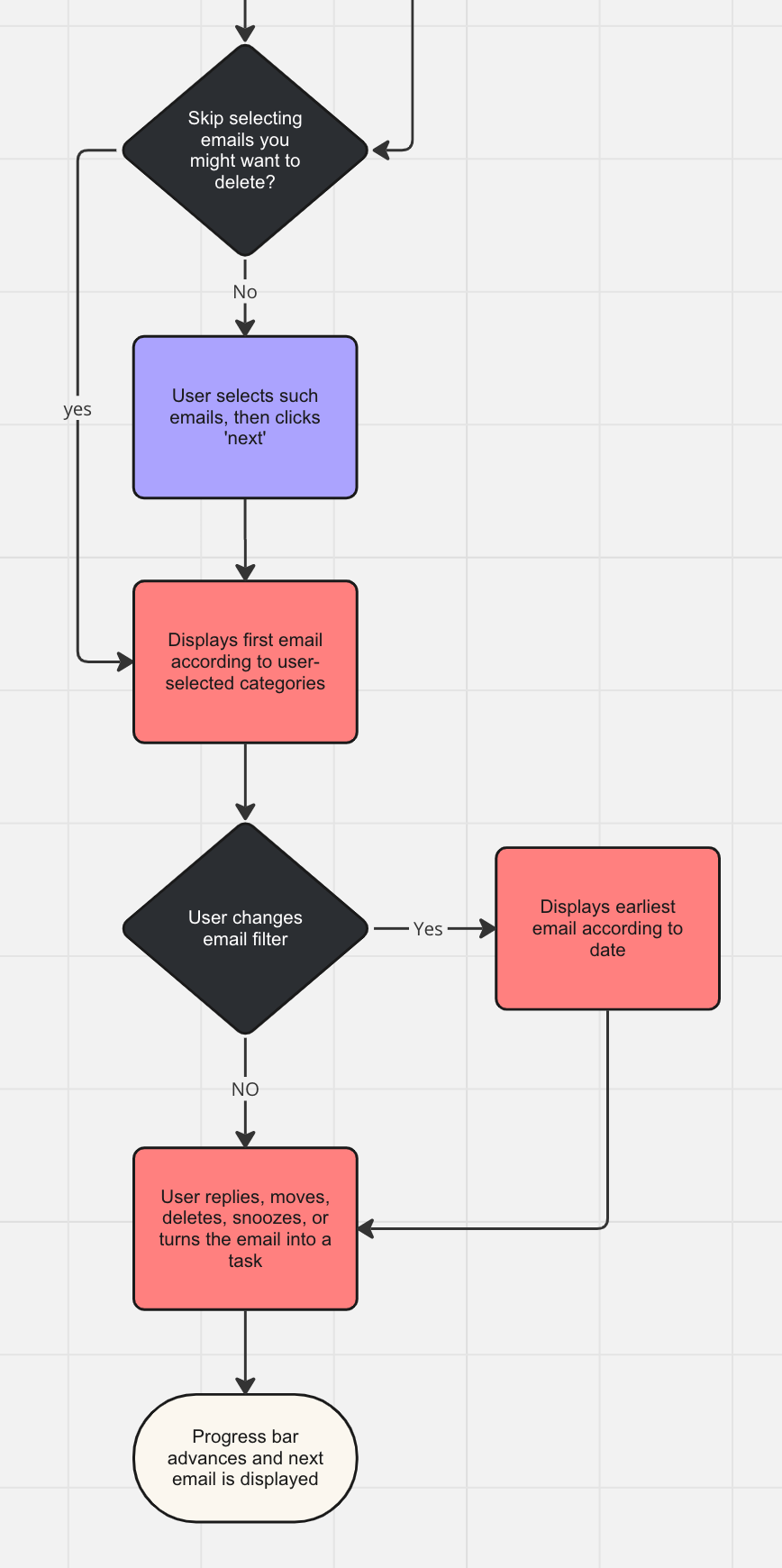
The basic concept is to take all of the actions that a user can do with an unread email and rearrange it into a sequential flow. This will entail:
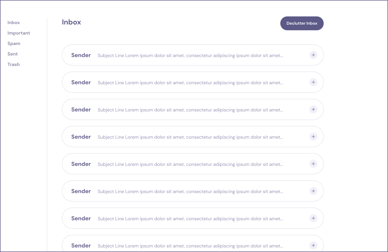
1. A button called 'Declutter Inbox'
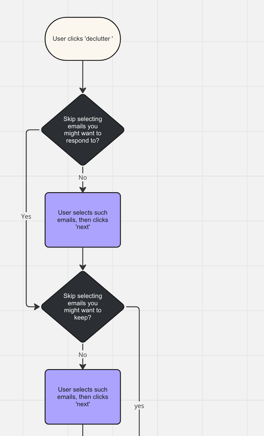
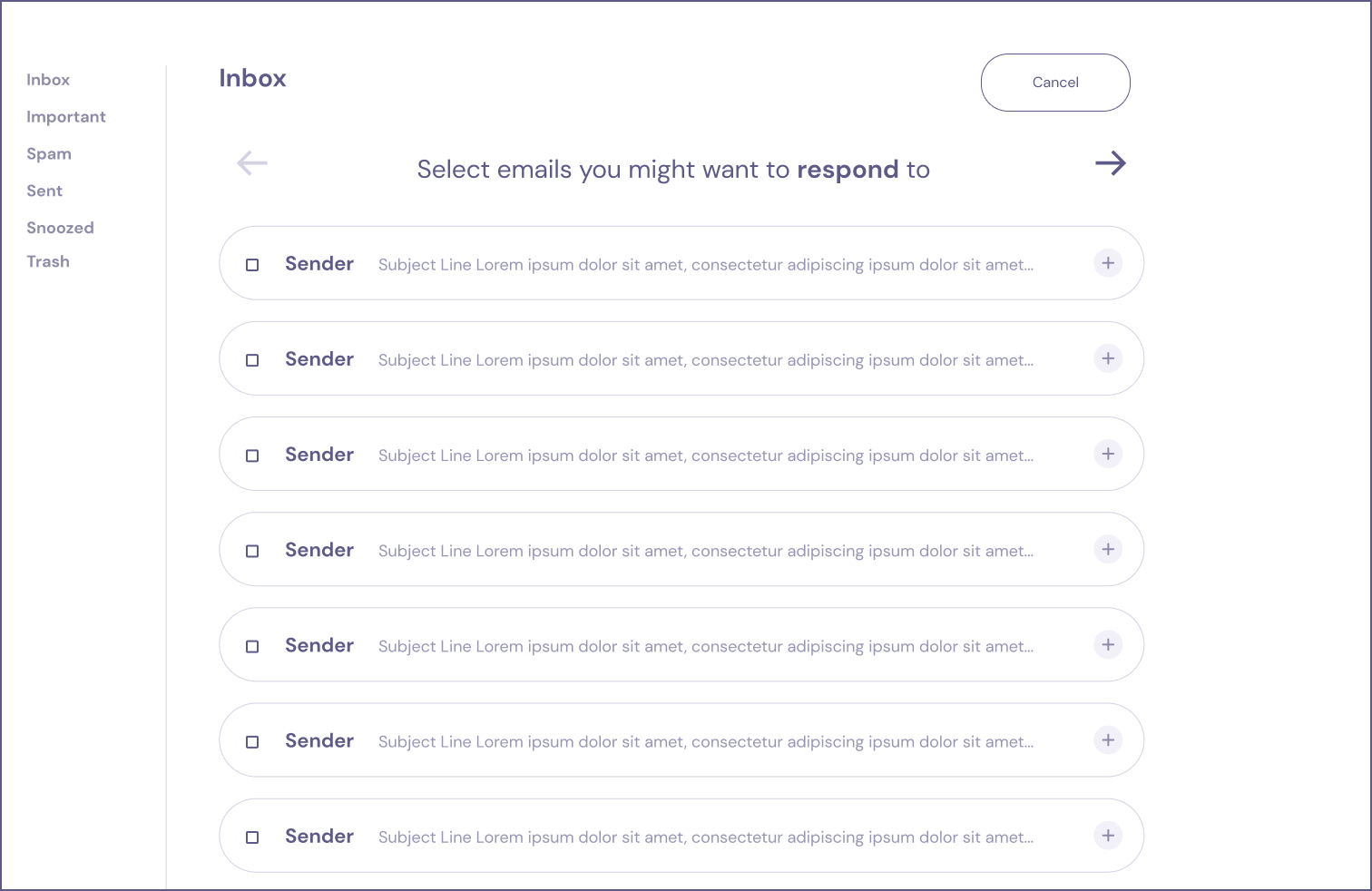
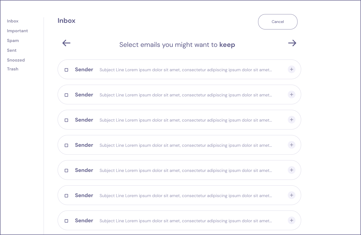
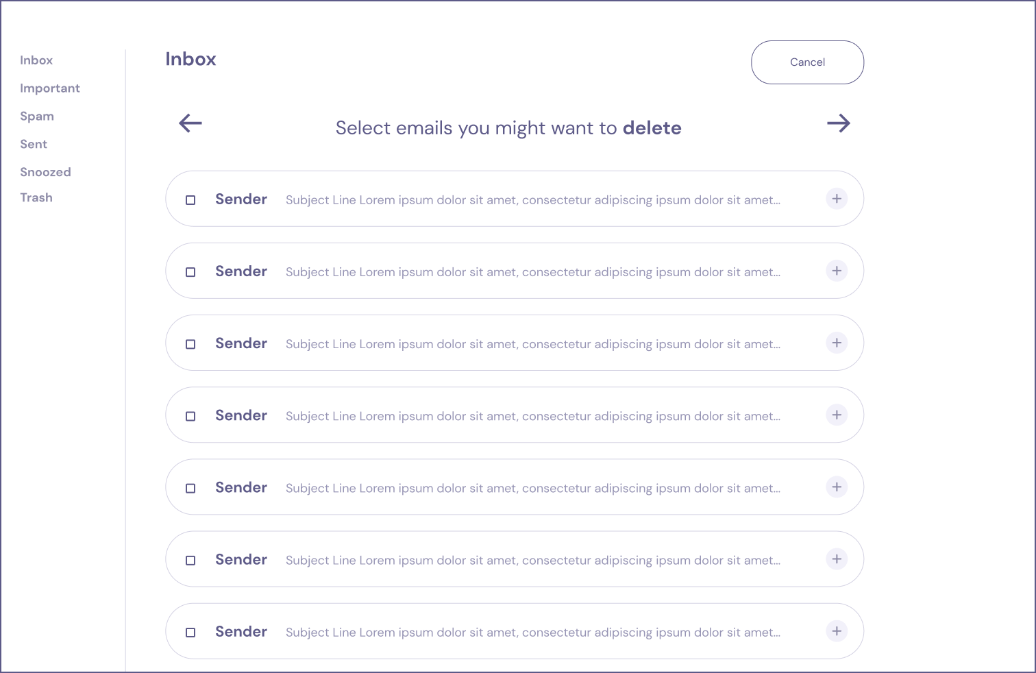
2. Clicking this button will firstly give the user the opportunity to categorize their unread emails based on what action they anticipate doing on them.
3. Once the user has sorted their unread emails, they will enter declutter mode in which they are shown the emails one by one in a horizontal scroll. The order of the emails, as well as the apparentness of actions, is based on the user's sorting.
3. A progress bar provides the user with delightful feedback as well as the ability to control the order in which they see their emails.
Visual Prototypes
Flowchart
Wireframes
Significant Features:
1. 'Declutter Inbox' button puts the user in a declutter mode
2. User is given the option to sort their emails by task
2. Customizable Progress Bar gives the user delightful and useful feedback throughout the declutter process.
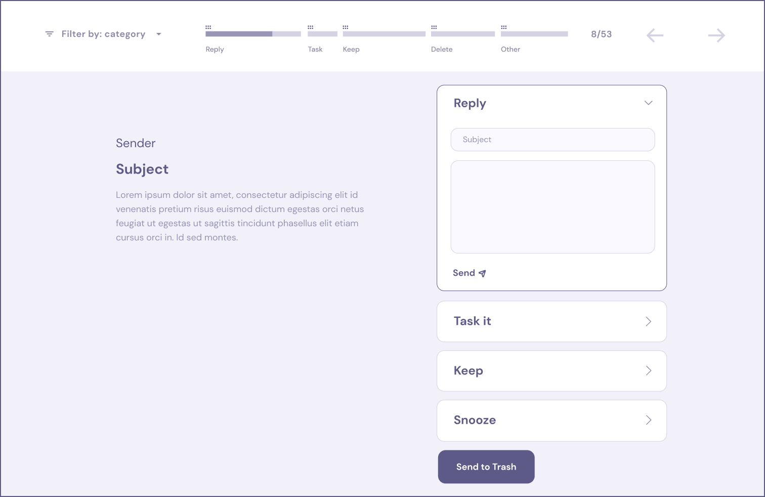
The Progress Bar


Further Possibilities
Designing the remaining three modules in the accordion is the next step. Each module will require its own research and exploration of existing solutions.
As for the broader design community, I see this project as a small contribution to a larger trend of rethinking email clients. While this movement has some clear trailblazers such as Hey or Sparkmail, I hope that this example of gaining inspiration from other contexts will help inspire designers who are tackling these issues.
Always remember to think outside the (in)box.

